.

Friday, May 28, 2010

TWO HUNDRED TWENTY-NINE.

We at PHI would love to wish you a wonderful Memorial Day weekend. Whatever your plans are, go out and enjoy this weather. Bright skies. A breeze. It's the perfect kind of backdrop for checking out to relax.

But before you go, take a little time to enjoy our Friday Favorites - as always, things that inspire us, things that we love, things that even surprise us - and this week, there's definitely one in particular. As always though, please enjoy!

CHEWING GUM. While my eternal dislike of chewing gum has forever been solidified by the likes of Willy Wonka, this is something really cool. "Chewing in Venice" is an art series by Simon Decker, showing several shots of Venetian streets covered in chewing gum. It's a coy play on shape and space, and maybe, just maybe, the way you think about gum.

SHARA PORTER. I can't believe Shara Porter hasn't already been a Friday Favorite already. Three of my favorite pieces are from her. Porter has some remarkable things, from smaller bags to clutches (mine, all mine!) and large bags - and she's not limited to any size. Do take the time to check out her work. It's incredible.

SAID THE GRAMPHONE. A good music blog is hard to find. And while they're out there, it's a matter of knowing where to look, how to look, and word of mouth. Rather than talk about irony and metaphors, which is were you usually go when talking about music blogs and the internet, I'd like to point you in the dIrection of said the gramophone, which takes its mp3 posting to entirely different level with really cool commentary and kickass photos.

OH BABS. Somehow, my knowledge of Barbara Streisand has been minimized to a weekly Glee reference and an odd trivia point. We're not calling it a favorite - nothing against Barbara or anything, or anyone who loves her - but we've decided to call it this week's strangest piece of news. Yep. I said. Strange. Not surprising, but strange. Why? Well, Babs is writing a book on design. Seems innocent enough, right? But if speaking in my overall knowledge of her, which extends to her politics and her film career (I blame the week I got my wisdom teeth out), it's just ... it's strange. My Passion for Design is more like an homage to Martha Stewart and her sense of "me, me, me" in her design taste and approach - basically, it's all Babs, all the time. So yes. Strange? Of course. Surprised? Not at all.

WALKING INTO FILM. In a new short film by Toronto filmmaker, Elizabeth St. Philip, the relationship between the fashion industry and the lack of black models is explored. The Colour of Beauty follows model Renee Thompson, and includes interviews with insiders like Lisa Tant and Jeanne Berker, as the subject is examined, through the demands and the continuous change the industry is going through. Check it out.

DON'T LET ANYONE TELL YOU GARDENING isn't cool, or let the heat scare you away for that matter. The best part about the warmer weather, when it's not trying to melt your face off, is the floors, and the really cool and innovative ways people start to tackle their outdoor spaces. STRING GARDEN offers fascinating conceptual ideas for a space, whether it may be to transform an entire indoor area or just a simple way of reinventing a small patio area by celebrating space.

IT'S INFECTIOUS, BOOGIE WOOGIE. When most of us think design, we think spectacular homes and gardens, interiors, and those really great shoes that you see in Barneys and then haunt you for the rest of your week. Core77 has a really great design feature on reinventing something completely ordinary - in our minds, of course - like a hospital. It's not that we don't measure a hospital as a small and basic space, in fact, it's quite the opposite; but hospitals are subjected to the same kind of thought of say, an airport - too big, too much, and an experience that you never want to talk about again. But this about keeping clean, effective, and ultimately results in a really fascinating and complex series of measures. Read it here.

GUERILLA GARDENING. I don’t garden, but if I did, this might be the greatest thing ever. Although I suspect the reason why this is a favorite is because of the amusement from the tagline “throw & grow”, the idea of gardening mixing with chaos is kind of interesting. Is it organized chaos? Or is it really a gimmick? Can I do the same thing if I toss a bunch of seeds over my head and call it a day? Regardless, it’s a fun way of looking at things, if anything else.

ZARA PICKEN. Picken’s illustrations are wonderfully colorful and really come alive in an exceptionally quirky way. Her blog is brand new, but building and offers both insight and accessibility to her creative process. Definitely check her work out.

THE PERFECT BAG. No, no. It hasn’t been found yet. There’s an ever-growing list, however, of bags that can function as awesomely sexy and chic and carry the small nation that doubles as your daily, necessary things. This bag by Ashley-Watson is a new addition to the list, made from recycled leather. Love the dark, rich brown color and that it’s far from being too small.

ART & LETTERS. There's nothing like a letter, whether you call it a dead form or not, and these stamps honoring Abstract Expressionist painters from the 40s and 50s may add excitement to an otherwise anxious visit to the post office.

(PHOTO.)

Thursday, May 27, 2010

TWO HUNDRED TWENTY-EIGHT.

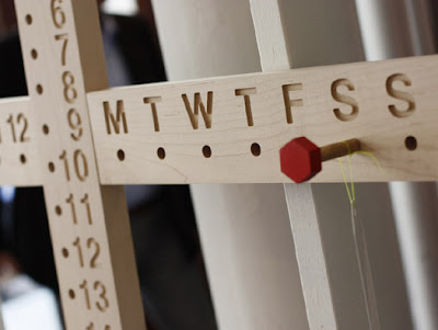
For the Cite Goes America is an exhibition curated by Alissia Melka-Teichroew and Jan Habraken during New York Design Week. Pictured above is one of the pieces, by Stanley Ruiz, a calendar that's nearly ageless. The show itself takes place in a 400 sq ft skeleton house full of current work by an array of really incredible American-based designers. Read more here.

TWO HUNDRED TWENTY-SEVEN.

(via ffffound!)
"Think of and look at your work as though it were done by your enemy. If you look at it to admire it, you are lost." - Samuel Butler.
This site is all kind of cool. It aims at providing outlets to all forms of design, whether it be graphically or architecturally, interior or exterior, art and so forth; it's almost a link hub, which I like a lot, and it has tons of really great, great quotes.

TWO HUNDRED TWENTY-SIX.

Things that make me universally happy? New Arcade Fire. Things that make me universally happy in the kind of way that chocolate does. The new Arcade Fire album being released on my birthday, August 3. There's a list of maybe five bands that sends me into some kind of joyous, musical coma, and Arcade Fire is without a doubt one of them. You can listen to their new singles, the Suburbs and Months of May here. And pre-order the album on the site as well.

Wednesday, May 26, 2010

TWO HUNDRED TWENTY-FIVE.

As you know, we're really excited about the opening of the Urban Hound's luxury hotel! For more, visit their website. You'll great information on staff, photos of their clients, and endless information on the progress of what's new, the buildout, and membership. Also check them out on Facebook, where you can follow them as well.

TWO HUNDRED TWENTY-FOUR

Startup Quotes is all about business, design, and witty wisdom. Check it out and then follow them on twitter.

TWO HUNDRED TWENTY-THREE.

Don't let the weather get you down. Or melt you - which more than likely to happen first, before it gets you down, for sure.

A few design tibits:

iPad + Velcro goes to show you that a little velcro goes a long way, whether you're trying to install some abnormally large installation or simply take advantage of the fact that you have an iPad and well, let's be honest, want to show it off.

FIT is hosting Eco Fashion: Go Green which is an exhibit that explores fashion's relationship with the environment. The term "eco-fashion" refers to the work of designers who use, produce, and otherwise promote sustainable, ethical, and environmentally-conscious products. It's still a contemporary practice, a very contemporary practice, but it's something relevant and necessary to explore with fashion's continuously changing face.

And we'll call these magic tiles, which are tiles designed in mind of how to recover heat loss, or energy loss, by being covered in thermo-chromic acid ink that reacts to heat. Read more here. It's pretty fantastic.

Tuesday, May 25, 2010

TWO HUNDRED TWENTY-TWO.

French artist Christian Boltanski's No Man's Land is one of the most ambitious installations that we've ever experienced, here and state-side. It's about exploring our own mortality, incorporating cranes and clothing, and more incredible things, like sounds of human heartbeats, gathered from all around the world. It's a mind boggling concept, heavy on sound and sight. For those of you in NYC, definitely check it out at Park Avenue Armory until June 13th.

TWO HUNDRED TWENTY-ONE.

It's Wedding Season for us at PHI, and by Wedding Season, I mean Wedding Season. Being super busy is just a great excuse to use italics, let's be honest. But to keep you readers up to date, check out our flickr page, where you can see some of Michelle's incredible pictures of some of our design plans including an easel installation and the wedding hoopa pictured above.

TWO HUNDRED TWENTY.

We've talked about Luxirare before, and how I want to draw hearts all over everything she does, including the incredible photos. BUT let's talk about these edible crayons, handmade healthbars comprised of various fruits, vegetables, nuts and chocolate covered sesame seeds. But that's not it - it's all held together by a melted marshmallow core. And you can draw with them. That's right. Draw with them. It goes to show you that innovation is never limited to size and space, but sometimes, the little things are just too cool for words.

Monday, May 24, 2010

TWO HUNDRED NINETEEN.

Love this. Joe Penrod makes counterfeit shadows using blue painter's tape. Check out the variety of places and objects. Check out his flickr here.

TWO HUNDRED EIGHTEEN.

The Joys of Jumpology is such a great article from the NYTimes about photographer Phillippe Halsman and a really great exhibition that showcases his work from 1940s through the fifties, showcasing some commissions from Life. Read it here.

TWO HUNDRED SEVENTEEN.

We tend to talk about a lot of things that we love, most things we want to share, and every so often, there's something that we talk about that achieves -- well, we'll call it a comment from the peanut gallery for the time being.

So what do you think about when you hear the phrase "over-design"? Me? I think of a plethora of sequins pasted all over a place they shouldn't be - and I like sequins - and said place may be the color of pepto bismol, which is not attractive. Don't even try to argue that one with me. Do not pass go. Do not collect two hundred dollars.

But sometimes over-design comes in smaller forms, where the idea or object or placement is seemingly standing with good intentions, maybe great intentions, but doesn't really work out. Now, I'll be honest, I love things like this. I get suckered into buying those stupid puzzles (and apps - we'll talk later, Apple!) that you're supposed to be entertained for all of five seconds, frustrated for five hours, and then when you finally solve it, your reaction is a sum of one word.

"Oh."

Design Boom did a feature on the daily stack, a time management tool created by a pair of designers that allows a user to track work flow. How? By creating physical representations of their tasks. It sounds like a really great idea, right? Take a look at the video, where the process evolves into a complicated venture, based on tasks and times, etc. It's an interesting venture, but it goes to show you how in all fields, there's always some sort of form over design and losing the original spirit of the idea.

So again, what do you think of when you hear the phrase over-design?

Friday, May 21, 2010

TWO HUNDRED SIXTEEN.

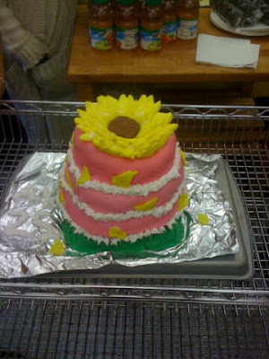
My witty story has suddenly been x-ed by the news of a Planet of the Apes prequel. I just don't know what else to say. HOWEVER. It's time for this week's Friday Favorites. And this week's featured photo is a special piece and an exceptionally cool showcasing that there's no age or limit to one's creativity. Check out the cake made by Zoe Sweeney, daughter of Partner Nilda Martin - it's her first real cake design.

NOW IN DESIGN NEWS. Bill Moggridge, the new director of the Cooper-Hewitt National Design Museum, is introducing his series called, "Bill's Design Talks" in which he will moderate discussion among designers and museum professionals on chosen tops. The series starts next week, Thursday, May 27th, and will feature a discussion with Michael Bierut, a partner at Pentagram, and one of Pentagram's designers, Yve Ludwig, about their design of the catalogue for the museum's 2010 National Design Triennial, "Why Design Now?"

THEN IT'S ABOUT SENSIBLE DESIGN. These days, it's about being conscious about design and everything green. To raise awareness about energy conservation, German company RWE has a really cool visual campaign, making the waste of energy a physical visible sight. Check the photos out.

TIP OVER. The Tip Over table was designed for G. Borgonovo for Porada and it really goes beyond the idea of the conventional, square table. It has the capability to serve as both a wall mirror and a table, that opens any sort of space for you. It's just a cool way of keep the feeling of a room or area without changing the entire feel.

ART APOCALYPSE. It's an interesting and scary thought, what life would be like without art in our lives. Ad firm Scholz & Friends tackle this question for the German Federation of Craftsmen and their tv spot - it's pretty bleak, far warning, but take a look at the video.

MARKET SEARCHING. PHI favorite Coco + Kelley has a really great entry on hunting through flea markets, etsy, and all things vintage. There are some gorgeous photos highlighting some incredible finds especially a favorite of yours truly - vintage records.

WHAT TO DO WITH THAT TOOTHPICK. I have these wonderful memories of my grandfather and his quirks, like the toothpick he always had after dinner. But I never really imagined putting toothpicks, design, and ... architectural replicas? Take a look at these pictures. Promise you, it'll make you sit back and examine the kind of patience you think you have.

APOTHEKE NEW YORK. Inspired by the history of apothecary in Europe and the artistic influence of absinthe dens in 19th Paris, Apotheke is all about the drama. A cocktail isn't just a cocktail. Check out their website, where you can view pictures of their really, really cool space.

DIFFERENT STROKES. Paol Volpi is an avant-garde jeweler, based in Rome, who transforms an unusual array of materials including industrial and automotive oil filters into gorgeous, fluid, and wearable pieces. It's incredible. All her pieces are both delicate and demure, unexpected given the nature of her materials.

Thursday, May 20, 2010

TWO HUNDRED FIFTEEN.

It's not a confession when I tell you that I love accessories. Ask anybody. And I've seemingly gotten over my feather ... dislike. So take this piece by Remnant Mimic, it has crocheted feathers, chains, more feathers (a charm!), and this great, pyramid stud details.

TWO HUNDRED FOURTEEN.

Step into the Sensory Box was designed and developed by the studio SUPERBIEN. ILLUSION360 has some fantastic photos from the event. Developed specifically for the company Alcatel-Lucent, Sensory Box offers an artistic and mobile experience in a cubic space that completely illuminates the viewer's experience. Check it out.

TWO HUNDRED THIRTEEN.

Remember in grade school when you had to write those essays that always started with a quote? It was usually followed by an "examine this." and "please explain why this passage of this obscure, random bit of dialogue is useful to the plight of the protagonist ..." - oh, yeah. That was college.

But Frank Chimero posted this quote from Rob Giampietro -

"Pizza is design."

Now, I could go and says something unapologetically cheesy like "reflect on this." and "please explain why, not using any BRAVO show as an example, this quote is relevant to anything we do..." because that would go over the text limit. But this a great quote, such a great quote, and really kind of a cool reflection of what we at PHI hold as our philosophy. Creativity is limitless and if anything, should be embraced in all capacities and forms. It's powerful and transformative. You can find design in anything. Including that pizza that sitting in front of you because you're too lazy to cook - and will definitely regret in the morning.

So instead of pizza, I give you something even better -

Frank Chimero's Text List is an assorted list of really cool links to essays and pieces that explore the nature of design in all disciplines. What I love most about Chimero's blog is that he always displays a thoughtful approach in what he writes and shares with his readers, and this list is no different - check it out.

WSJ has a really great article on Valentino and the evolving face of the brand, how it is being reinterpreted and branded to face the changes in the fashion industry.

And The Design Observer Group talks about the new film Please Give, starring Catherine Keener, which examines the question of how to live within our means, and all avenues that affect it.

Wednesday, May 19, 2010

TWO HUNDRED TWELVE.

idea nomads is a blog that features designs, in all mediums, from around the world, in all walks of life. Take the subways of Tehran, where you can hold onto these plastic handles with beer and soda cans inside. It's a cheeky hint of product placement and a very cool way changing a daily commute. Check the blog out!

TWO HUNDRED ELEVEN.

We've posted a variety of mediums on the PHI blog so far, from street art to large scale photography installations. New to the list? Woodsculpting. Artist Anthony Santella pulls from his religious and Native American influences to create some stunning, if not eerie take on the ever cyclical relationship between man and nature. It's pretty too. You can view more of his work at his personal site here.

TWO HUNDRED TEN.

The Creators Project has a really fantastic interview up with Brazilian designer Muti Randolph. Randolph's claim-to-fame is that he designed the famed D-Edge nightclubs in Brazil, as well as conceptualized and built Galeria Melissa in Sao Paulo. He's especially famous for using a variety of mediums in his projects, melding architecture with industrial design, media and music, and engineering.

Tuesday, May 18, 2010

TWO HUNDRED NINE.

Sometimes you have to approach a room like a puzzle - do all the pieces fit? A great piece, however is this nebula console from Arktura. There's something really intricate about the lines and how they seem to explode - a subtle pun, I know - but it can be used with or without its glass top. Check it out!

TWO HUNDRED EIGHT.

Open letters are a lost art. Letter writing in general is a lost art, but that's another time, another place, and a larger latte during the day, a day where the final episode before the LOST finale airs. I digress.

But you know what I'm talking about. Those letters, the ones that you feel like writing to the universe ever-so often - or, sometimes, at the end of the week:

"Dear Universe,

I know it's the city. But if you're going to stage a drunk guy outside my window, please don't have him sing "In the Navy" at four o'clock in the morning. Maybe he takes requests next time?

Thanks."

True story. Anyhow, Dear Meat is one of those reasons why I love letters, and why blogging is such a unique facet of our lives. It's a daily drop into the open letters that a lot of people write, that you may want to write, and definitely something to make you laugh. Check it out.

TWO HUNDRED SEVEN.

Photographer Oscar Ciutat's photoseries Caged (2008) is such an incredibly powerful series, where he focuses on the eyes of these animals who are in zoos. Take a minute to go through them - there's something haunting about going through, photo to photo, and seeing each animal as they are.

TWO HUNDRED SIX.

Destino is an animated short released by Disney in 2003, the completed project of a collaboration between Disney and Dalí. The project actually began in 1945, some 50+ years before it was actually completed. Take a watch.

Monday, May 17, 2010

TWO HUNDRED FIVE.

Happy fifth anniversary to YouTube! Thanks for being around for all the Project Runway recaps, the viral vids, the ability to make momentary fools out of CNN correspondents, and being fantastic enough to entertain us through the years. To celebrate, check out the first official teaser trailer for the new Anton Corbijn film, The American. Corbijn, as you may know, gave us the brilliant film Control, which chronicled the rise and fall of Joy Division lead singer Ian Curtis.

TWO HUNDRED FOUR.

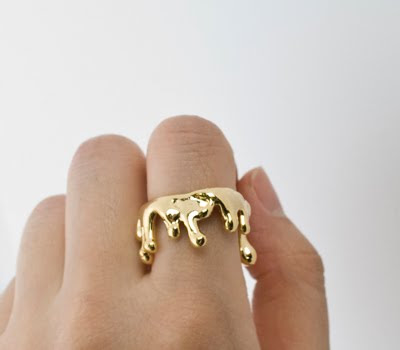
The problem with spring is that it's universal unkind to my wardrobe, and subsequently, my bank account because the vast array of gorgeous prints and colors, cute dresses, and the perfect sandals. It's like design conspiracy, I tell you. But what is universally dangerous, and exempt from all seasons, is jewelry. Designer Jung Eeun has created a range of jewelry inspired by the drops of wax that candles make as they burn. It's quite cool, and the shapes are unique in every way; pieces come in gold or silver, and I definitely have an enormous amount of love for the gold ring - and I don't like wearing rings - as an sort odd crown, almost reminiscent of Max's crown in Where the Wild Things Are.

TWO HUNDRED THREE.

I think there's this underlying fascination that, ironically, seems to be a continuous theme in what I've been reading today, but it's with bodies and systems and skeletons and what have you; it's the very basics of how things work, how we and how animals work. The cool thing about this entry (and not what I was reading earlier, which I won't discuss as it's lunch time and that would be too, too cruel ... it does have to do with a particular museum in Philadelphia though ...) is that you can see how this fascination translates when it merges with street art.

There's a really cool show going on at the Factory Fresh in Brooklyn, featuring the works of artist ROA. It's running until the 30th, so you have plenty of time and very little excuses to go and check it out. Especially with the beautiful weather.

TWO HUNDRED TWO.

Somehow, you never know what to expect when rocker kids and in this case, rocker wives come out with their own albums. I suppose that's the nature of the beast and expected skepticism is expected skepticism when you're married to the likes of Jack White. But Elson's album, produced by her husband, comes out the twenty-fifth and from what I've heard so far, it's not something to be passed over completely. The album title The Ghost Who Walks, and the subsequent first video single, also directed by white, is seemingly appropriate. There's something uniquely haunting about Elson's voice and in a really strange, almost romantic and the video is an apt example of her talent. You can check out the video here (yes, I'm just as surprised as you are to find that MTV still knows what videos are) and look out for her album in the coming weeks.

Friday, May 14, 2010

TWO HUNDRED ONE.

Thursday nights, I've decided, should be a night that I don't watch the weatherman explain to me what kind of weather we're having. Because LIES. Regardless, happy Friday PHI readers! Hopefully, you have something wonderful planned or are simply ready to enjoy the weekend. And as always, this week's favorite things:

SOMETHING NEW. What you need to know about Seven Ply is that they make going green look incredibly cool. They take recycled old, broken, beat-up skate decks and turn it into a great piece of jewelry. Visit their etsy shop.

A ROOM OF YOUR OWN. What I find really interesting about designers is how their work, or rather, their personal taste translates into their own spaces. Norwegian interior magazine Nytt Room examines up and coming designers and their own spaces; it features a look inside designer Julia Edin’s apartment, a cozy peek into a very cool space.

LAMACEK. The Lamacek lounger is one of my favorite pieces from the company. The cushion is made using felt that is made of recycled plastic bottled and backed with a magnetic sheet that provides adhesion to the metal base. It’s also removable from the cushion for dry cleaning purposes. The best part? The lounger not only rocks, but it bounces.

BACKYARD WIND. With the weather slowly approaching something of the warmer variety, we're sure that many of you are trying to utilize any sort of outdoor space that you have. Sometimes it's not just about the plants, the floors, the odd bar, and those chairs that you hate in the beginning, but then love later. Check out the Wind Collection by Jordi Vilardell for Vibia, which features light and airy shades with colors that compliment any sort of outdoor space that you'd like to make yours.

NINA & LOLA. Of course, there’s a circus of boutique blogs. This is the internet, right? And you can absolutely go from one store to another, comparing prices and pieces. So what makes Nina & Lola different? There’s nothing like a stylishly clean blog with simple navigation – you can search by designer, vintage, and other categories as well as pick your currency, which is probably a main compliant I have with other sites. But there’s something really great about a site that understands its audience, who’s reading and where they’re coming from. Check it out.

SAY CHEESE. Let’s be real here. Who doesn’t love looking at gorgeous photos? The added bonus here, in addition to the gorgeous photos, is a really great commentary on photography and graphics, ultimately the perfect example of the way photo blogging should be.

THE VENDING SPREE. We may be a little bit in love here with this about description, “I am going to consume and review every item in my office vending machine and there is nothing you can do to stop me.” This is exactly why the internet is as awesome as it is.

BEEHOUSE LAMP. This is a pretty cool concept. Taking the idea of a beehive, the bee's natural inclination for building, and crystal technology, the designer incorporates all of this into creating the fixture. It's definitely one of those things that we'd love to see lit.

THE DEAD WEATHER. To be clear, there’s not a Jack White side project that I haven’t liked, there’s not a song Allison Mosshart sings that I don’t love, and of course, I’m going to by the new album, which came out on Tuesday. There’s nothing not to love about their sound – a little blues, a little old school rock … seriously, nothing that I don’t love at all. So pick up Sea of Cowards, pick a quiet couple of hours, and listen to the entire album. Some favorites? Blue Blood Blues, Old Mary, Die by the Drop, Gasoline.

KAREN WALKER. There's been a real love for anything vintage as of late - not that it ever went away. But you're beginning to see great pieces and accessories like these Karen Walker glasses, brown and gold detail, cool lines, and great for a really nice day at the beach. They're super fabulous.

(PHOTO.)

Thursday, May 13, 2010

TWO HUNDRED.

Talk about a really cool, cool shopping experience - although, I'm partially biased because I really love Marc Jacobs. But Stephen Jakitsch Architects designed the new Marc by Marc Jacobs store in Milan, including the brand's first cafe and bar, which makes it even cooler and gives you an entirely different reason not to leave the store. It's located in Milan's historic Brera district. Check the photos out.

ONE HUNDRED NINETY-NINE.

Share-a-chair! And avoid big butt jokes. All kidding aside, designer Laszlo Rozsnoki created it by carving a wooden chair in two equal parts, then fitted it with extra legs; the halves then become a chair that can be used together or separately. Check it out! It's pretty cool.

ONE HUNDRED NINETY-EIGHT.

I ... don't know how to feel about this? Ironically, it's funny that I decide to take a break now and update the blog, as I try and work out some language for a project. Stumbling on the P-tree (I know.) may mean (I know.) that the universe is trying to tell me something.

But P-tree (okay, okay, I'm giggling.) is a concept by designer Sam van Veluw that seems to be trying to reinvent the inevitable confrontation you may have with a dirty toilet during your favorite music festival. And you know dirty toilets are limited to just music festivals ... but it's kind of an ingenious concept if you think about it, and unfortunately, I'm thinking about it, trying to provide a way of avoiding that moment alone with the enclosed space of doom. It goes to show you that design takes all aspects of life into consideration. My one complaint? Nobody needs to watch.

Tuesday, May 11, 2010

ONE HUNDRED NINETY-SEVEN.

Confession. I'm a complete and utter sucker for art-based documentaries. And HERB & DOROTHY is no exception. The story of a couple, the Vogels, a postal clerk and a librarian, who managed to built one of the most important contemporary modern art collections. After thirty some years of meticulous collecting and buying, they managed to accumulate over 2,000 pieces, filling every corner of their tiny apartment. Check out the site where you can view a trailer and read more information about the extraordinary couple.

ONE HUNDRED NINETY-SIX.

P.S. I MADE THIS is my favorite site this week, full of fantastic graphics, inspirations, and of course, things that they've made. Like this great pom-pom necklace. Gorgeous colors, set for spring. The slogan is pretty great too, " [P.S I Made This] is a movement. It's a call to action to re-image, re-use, and re-invent." And join the mailing list too!

ONE HUNDRED NINETY-FIVE.


A few things before tonight's LOST because if you're like me, you know the world doesn't exist for that hour and few minutes.

But if you're looking through the latest issue of The Improper Bostonian, you may recognize a few faces in the Improperazzi! - our very own Nilda Martin and Sean Sweeney at this year's Greatest Party on Earth. Check it out by picking up the issue!

And running until September 4th is the Dr. Lakra exhibit at the ICA, which showcases the incredible and provocative works of the tattoo artist. Even cooler? Converse is sponsoring the exhibit.

Be sure to check it out.

Monday, May 10, 2010

ONE HUNDRED NINETY-FOUR.

I like to think of Andy Rooney as that crazy, cranky relative that from time to time thinks he's relevant or in touch with something relevant, but not. He's the guy that might sit in the corner of the diner and just scowl at you for blinking the wrong way. But within that ranting and raving about getting old and not knowing who Lady Gaga is, he makes an interesting point about music today. How does one stay relevant?

ONE HUNDRED NINETY-THREE.

I know, I know. I have waxed on and on about tumblr, back in the day, like it was something to talk about on Christmas morning. I still love tumblr, don't get me wrong, and have had to go through several intervention periods where I had to stop looking through the different blogs - like SHOELUST, where I would salivate over shoes that I'd kill to own (but you know, I have to pay my rent ...) and then there are the random craft pages, blogs dedicated to Michael Buble being stalked by a raptor.

But then there are blogs like Hello New York who ultimately show you some incredible images of the city, the kind of image that both serve as iconic and romantic view of the city, whether it be within the city or just passing by. Definitely take the time to go through them.

ONE HUNDRED NINETY-TWO.

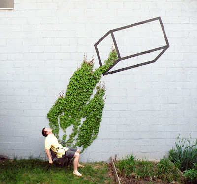
I've always been incredibly fascinated by street art, the way it's always unconventionally placed - it's the how, the where, and the why. It's always amazing to see how an entire space is transformed, which presents an unexpected quality to a lot of work. But these questions - the how, the where, and the why - that are ultimately not answered, but you can't help but wonder regardless. Aakash Nihalani, based in Brooklyn, does some incredible things with size and composition and with color too. I really love how there's this clarity that works with the composition presented. Check out Nihalani's work here.

Friday, May 7, 2010

ONE HUNDRED NINETY-ONE.

We here at PHI would really love to wish all the mums a wonderful Mother's Day weekend. It's an important weekend, everyone, and make sure that you that you take the time to give a little something to that incredible person in your life.

It's an interesting group of Friday Favorites this week. The stunning photo to your left is from Michelle's personal stash and it's not just anyfavorite, but also a great way to let everybody know that there will be some news regarding a future show. So definitely look out for that.

NEW BRAHMIN. We love these Boston gurus New Brahmin, where you can go to find the latest news in everything fabulous and fashion-forward. Looking for a great local source? This is where it's at. Such a refreshing look at style with quirk and personality - a personal favorite of yours truly. Check out their featured editorial!

ALL THAT GOLD. One day, there will be someone who will be able to explain the deep root of my fascination with gold and sparkles - and the occasional happy medium of both. Like designer Tom Dixon's Etch lamps. Dixon is known for how he deals with the physical and economical constraints of production, being inspired by the process himself. It's a love affair with shape and structure and simply gorgeous.

ART THAT WAS ONCE ALIVE. Well, I don't know. The New York Time's Sciene page is every bit the hit and miss with me sometimes. Then I found this slideshow. Think Ripley's Believe it or Not ... except with an artistic twist? There's some incredible pieces in here, I will say. Fabián Peña's The Impossibility of Storage for the Soul I (Self-Portrait) is pretty incredible as is Marc Swanson's Untitled (Antler Pile), which says so much for interpretation. Check it out. But during daylight. Seriously.

MAY THE FOURTH BE WITH YOU. As I was only exposed to the unfortunate prequels of the series first, my reaction to Tuesday's #starwars trending on Twitter was more amused than anything else. So happy belated Stars Wars day (get it - may the fourth be with you? I know, I know. I was thinking that too.) and check out Chepo Peña's Space Loteria - a combination of the tradition Mexican Bingo game with illustrated cards and classic Star Wars characters. It's very Lucas, filled with puns and sorts, but pretty cool as well.

BIRCHWOOD OFFICE. Almost didn't want to share these because they're that fantastic. From Netherlands designer Werner Neumann, this armour looks as if it marched right out of a Dali painting or perhaps through the looking glass. The wood detail is gorgeous.

BETTER HOUSING. Often, we tend not to think about how award statues are designed because most of the awards that really stand out in our minds are either entertainment classics - a la the Oscars, the Emmys - or Olympic oriented like this year's Vancouver 2010 medals. But Noah Scalin of Another Limited Rebellion created probably my favorite award trophies of the year. Better Housing Coalition's Groundbreaker Awards honors four incredible people for their contributions to the community in Richmond, VA. Read more about his process here.

d~luxelist. Another great blog to add to your reading list? d~luxelist is responsible for the major of the things that I've fallen in love with this spring. Like French designer Vanessa Bruno's satchel or this silk tee by Bensoni. I haven't found anything that I haven't liked yet.

THE CARTIER LOVE BRACELET. Always a classic, and a gorgeous one at that - The love bracelet is a signature piece from Cartier. The bracelet quickly became popular for its provocative resemblance to a medieval chasity belt.

And lastly, to end on a fantastic note, these birds by PARRA. The not so happy bird is just a charming gift to maybe give this Mother's Day. Check it out!